Navigation:
New navigation from old “hamburger” style to a streamlined tab bar approach with 3 top levels of navigation.
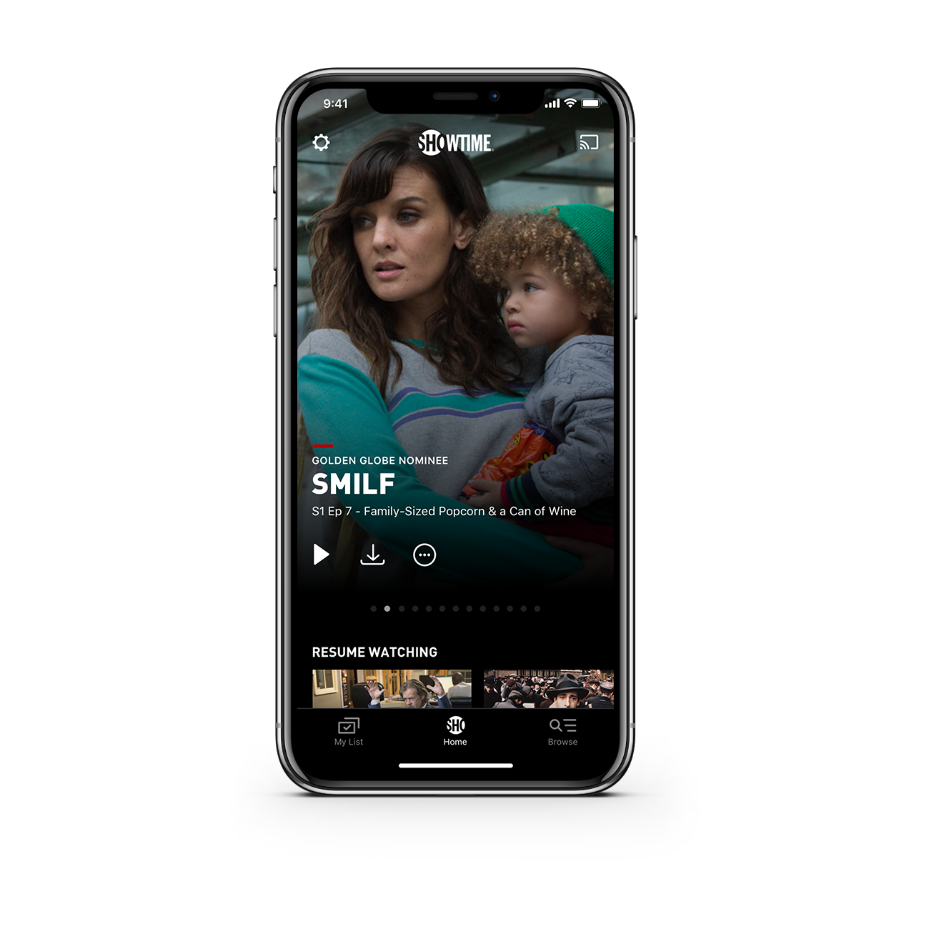
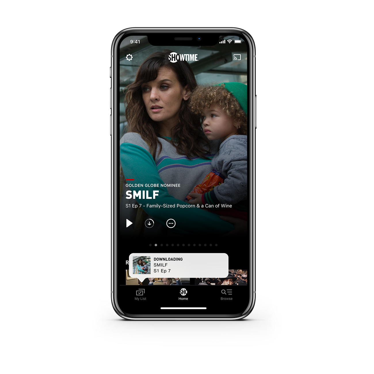
Home:
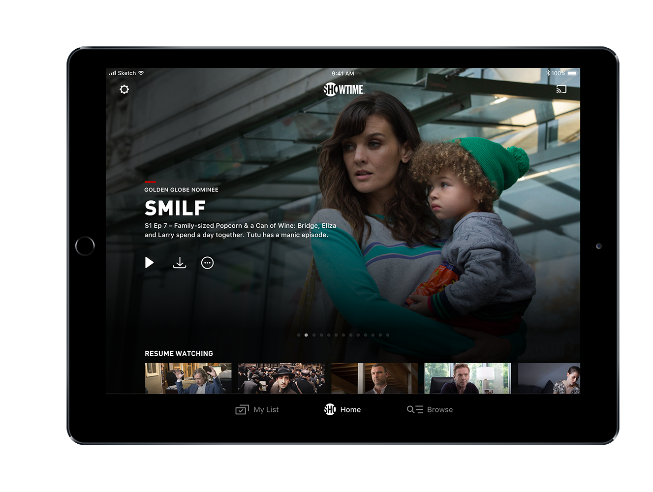
Streamlined Home experience with new typography and iconography, including the addition of Resume Watching on Home, to give users quicker access to content they were previously watching.
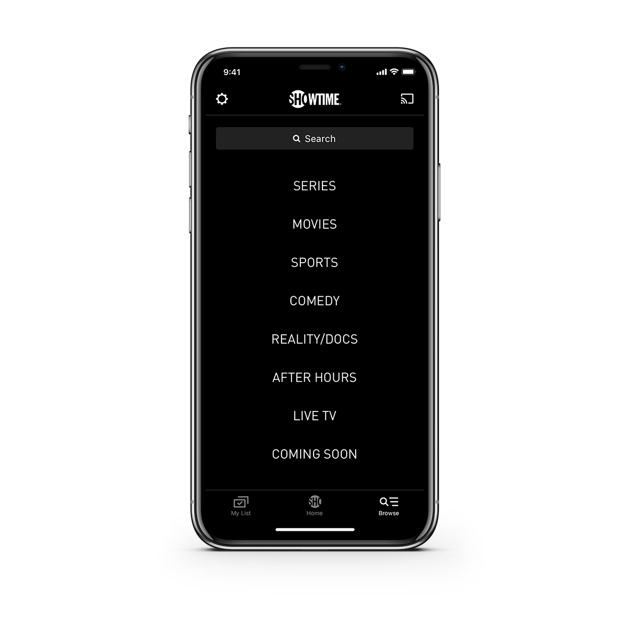
Browse:
Combined search and browse experience, allowing users to search for content directly or explore content categories.
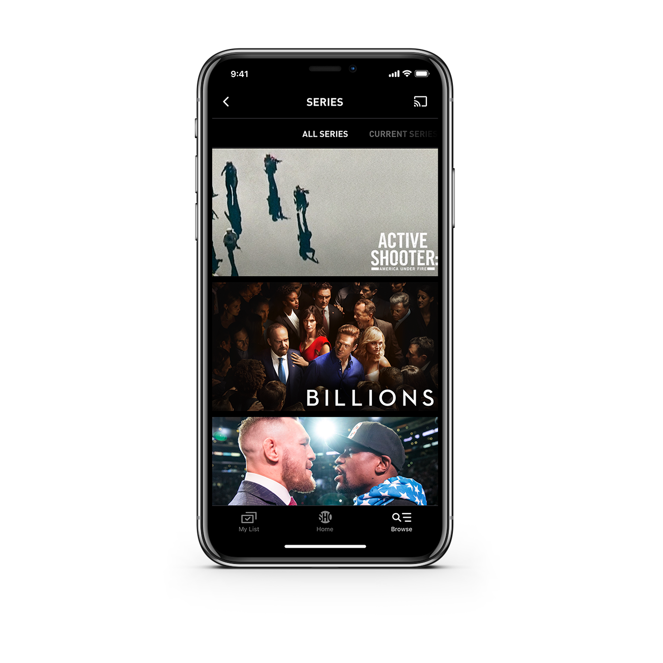
Series Grid:
Series grid remained similar to previous app version, but the team worked to unify and simplify the image sizes used throughout the app. Instead of countless custom images being created and served, new images were one of a few standard sizes.
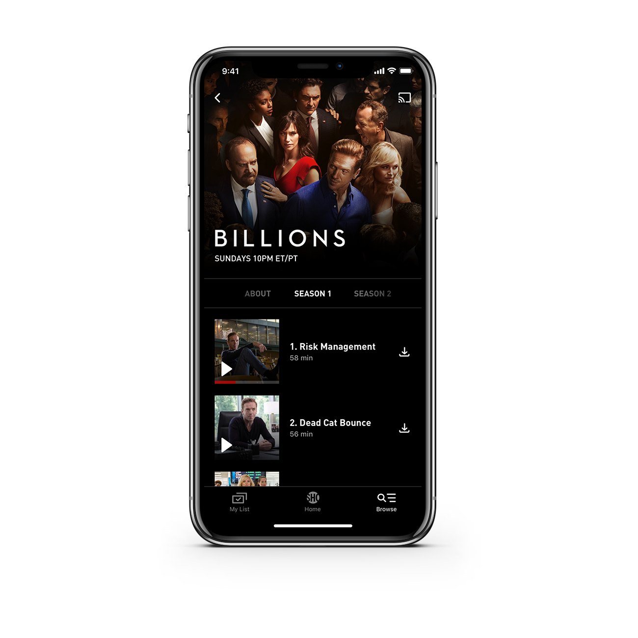
Series:
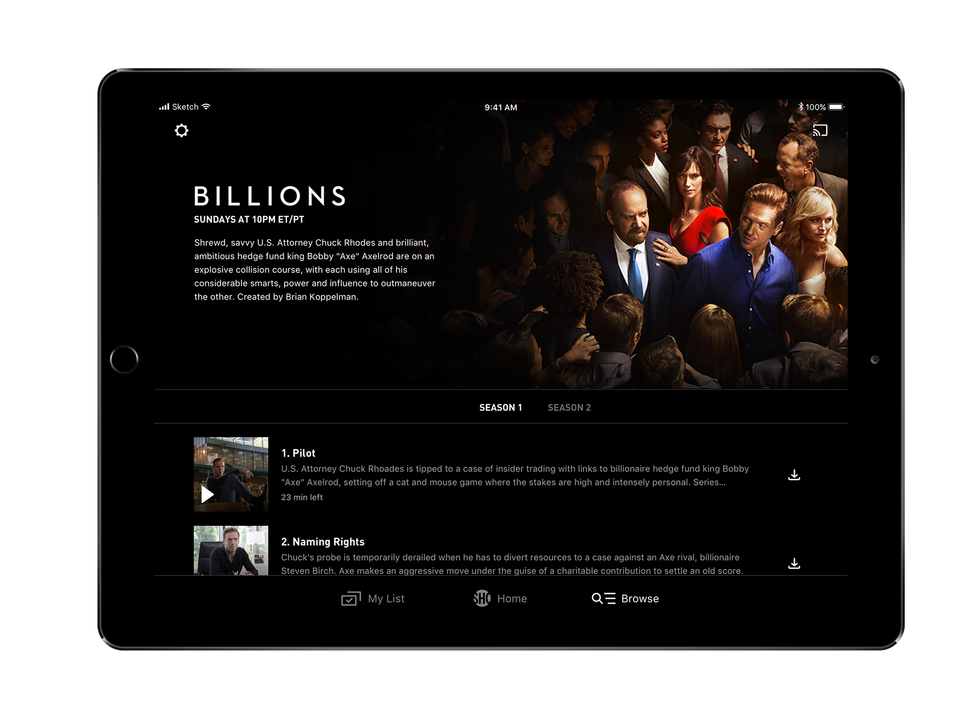
A move towards a new list view for series, so users can easily download multiple episodes in a row. Additionally, list would scroll to a user's resume point, allowing easy access for binge watching.
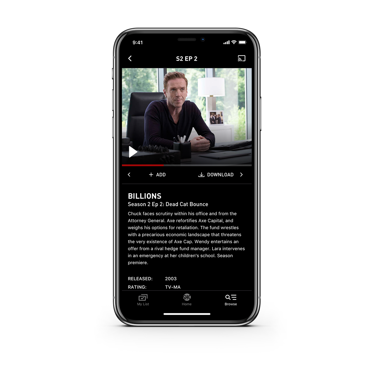
Episode Detail:
Episode detail remained similar to prior versions of the app, though we were able to update iconography and typography. Additionally, play was given higher prominence over the other actions on this page. Swiping left and right would take users to the previous and next episodes.
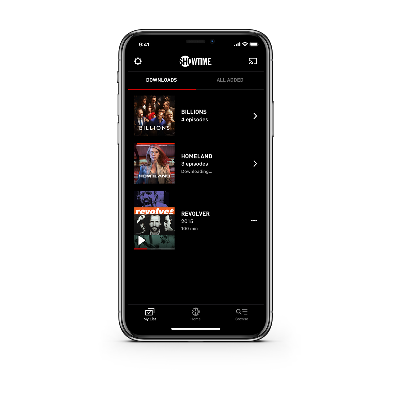
My List:
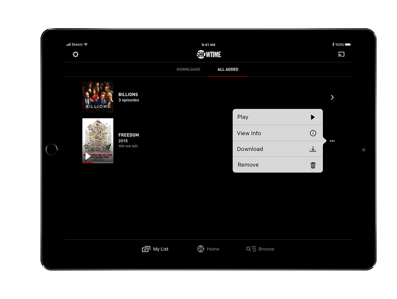
Updated My List section, broken into downloads and user-added content. Content is grouped by series, allowing for a more streamlined experience. From the context menu, users could take quick action such as deleting, downloading, or viewing info.
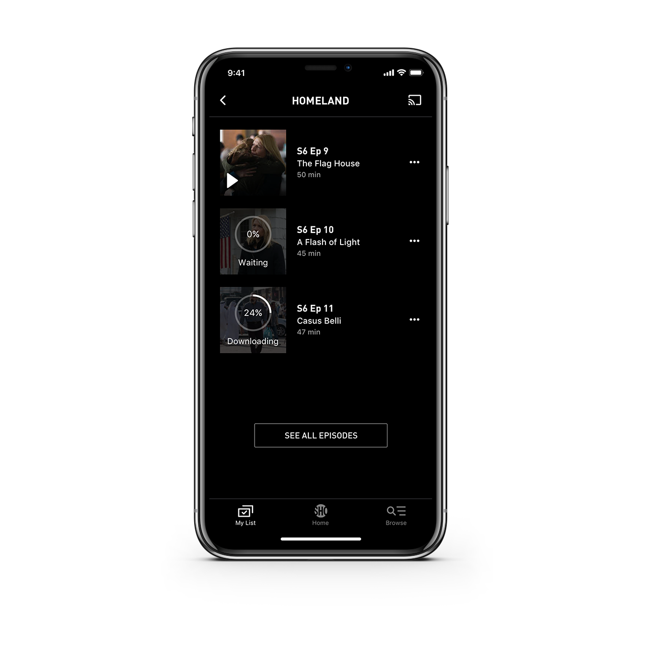
My List:
This is the series-level view of My List. Episodes are displayed in a clean list view, while overlays display important info related to download progress. Additionally, below button quickly links users to more episodes from that series that they can engage with.
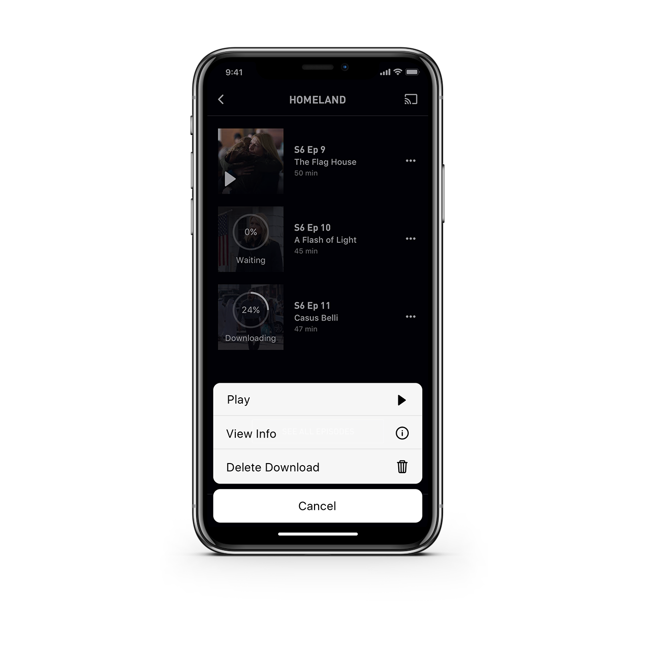
My List:
Example of an action sheet that would appear when a context menu is tapped.
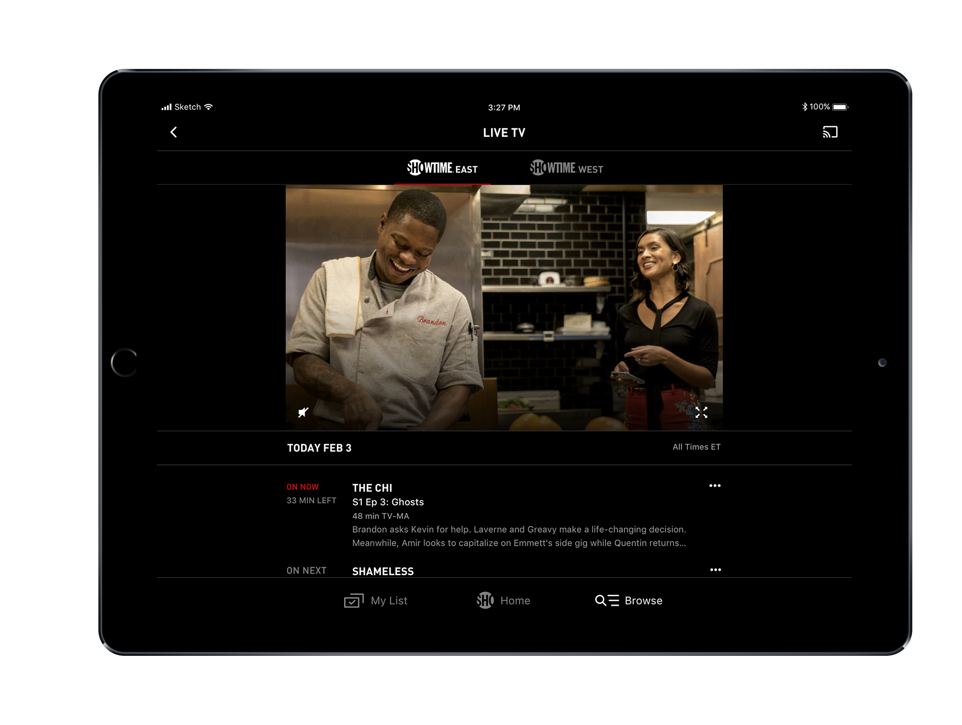
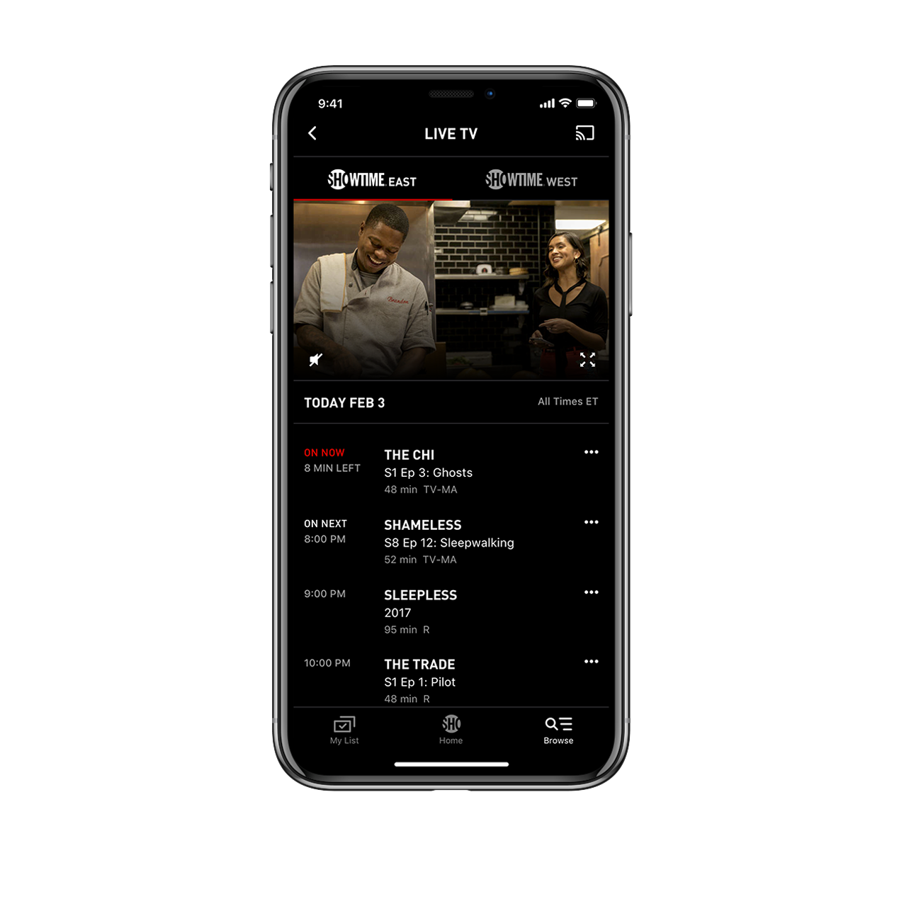
Live TV:
Updated Live TV experience. Tabbed view allows users to quickly switch between channels. Initial view displays live video, which minimizes on scroll to allow users to focus on the rest of the schedule.
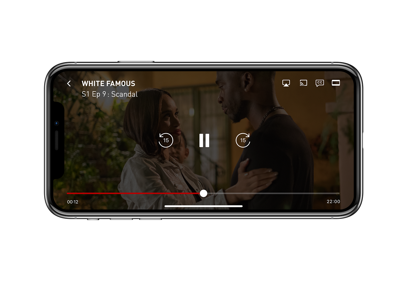
Player:
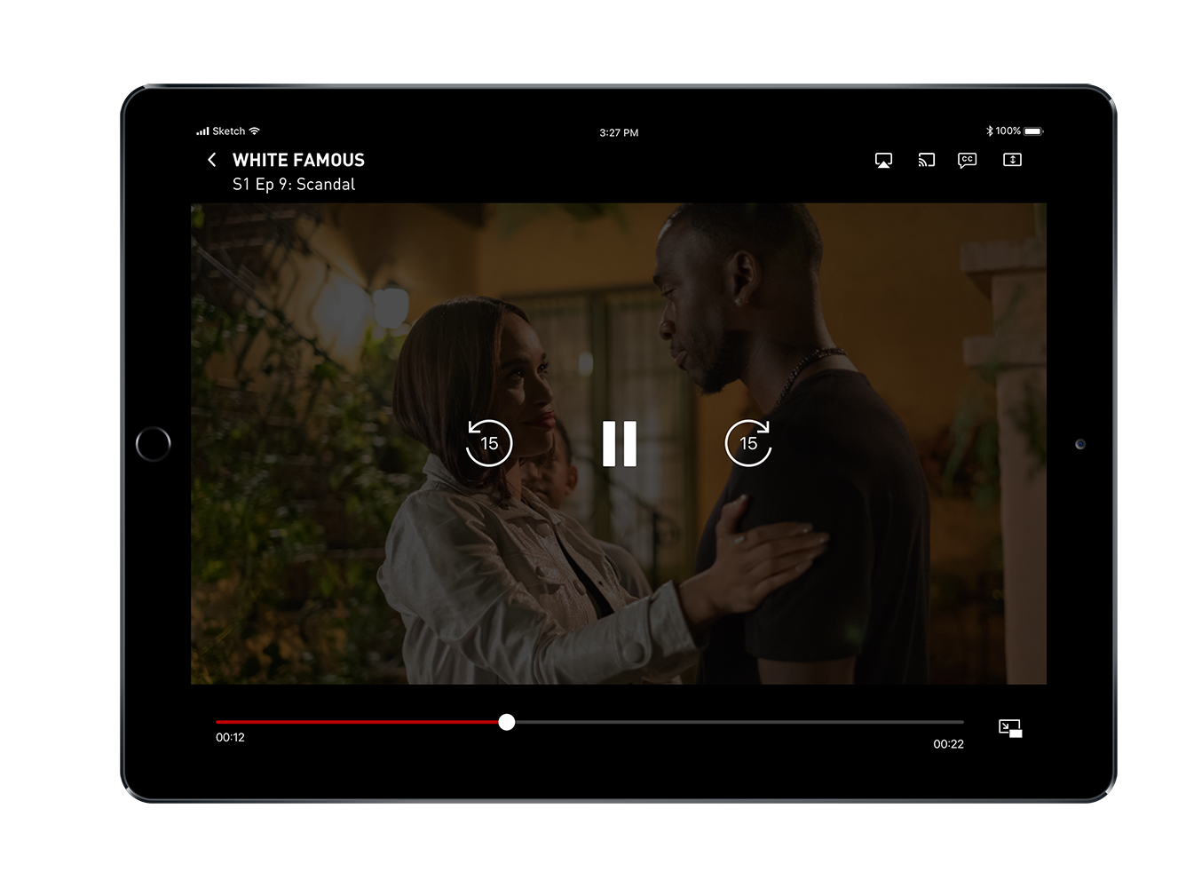
Updated player experience. Iconography and UI were re-designed. Scrubber size was increased, and controls were enlarged and centered for easier use. Since autoplay was added as a new feature recently, the addition of episode number was an important new feature to add for context while binge watching. Secondary actions such as captions and airplay were moved to the top right corner.
iPad:
Sampling of some of the iPad screens.